


LzyPNDA TWITCH ASSETS
INDEPENDENT PROJECT
GRAPHIC DESIGN / BRANDING
DURATION: JUNE 2020 (1 WEEK)
ILLUSTRATOR / PHOTOSHOP
OVERVIEW
My friend started to stream on twitch.tv about a month ago and I wanted to make some stream layouts and assets for her. I thought this would be a great opportunity for me to work on my graphic design skills as I thought they could be improved.
IDENTIFYING THE BRAND
I chatted with my friend to identify what type of theme/branding she wanted to represent her on Twitch. We decided to take her username into account as she identified as being lazy and liking pandas. Next we discussed her favorite colors and any other ideas she wanted to incorporate into the design.
Here were the contributing factors:
Brand must convey laziness and pandas.
Design should be cute and have a paradise/island theme to it.
The color burgundy should be incorporated into the design.
RESEARCH
Before coming up with a logo/icon, I researched other logos/icons with pandas in them to gain inspiration. Here are some of the ones that I found:

I liked how each of these made use of negative space or (those who are familiar with psychology) closure from the Gestalt Principles. Therefore, I wanted to use this idea in my design as it was clean, simple, and elegant.
DESIGNING A “LAZY PANDA”
On my first attempt, I was able to come up with this design. While it had the appearance of a panda, it felt rather basic and lacking of personality. The portion that was a part of the panda’s body also looked like a beard. However, it was a good starting point.

On the second attempt, I replaced the black with a burgundy color as requested by my friend. I then connected the ears with some of the face, leaving the a portion of the top and bottom of the face exposed. I also added hands, some blush, and some leaves to give it some personality. While I was content with this iteration, I still thought it could be improved.
Also, with this iteration, there was a huge problem that I overlooked. The use of the negative space would only be effective if the panda was placed on a white background. If I chose to place it on one that was colored, it would look unappealing.

On the third attempt, I connected the lines on the face so that it was closed. I also turned the hands outward so that you could see the paws and as if the panda was peeking out from somewhere. I also changed the design of the leaf so it would not look like it has hair on the top of its head. With this iteration, it looked much more appealing and had the cute and lazy characteristics. Furthermore, it could be placed on any background.

After these iterations, I showed my friend the second and third ones to see which one she preferred and if there were any changes she wanted to see. She said that both were cute but ultimately liked the third one, and so that was the one we went with.
Here are the final designs, along with some extra expressions:

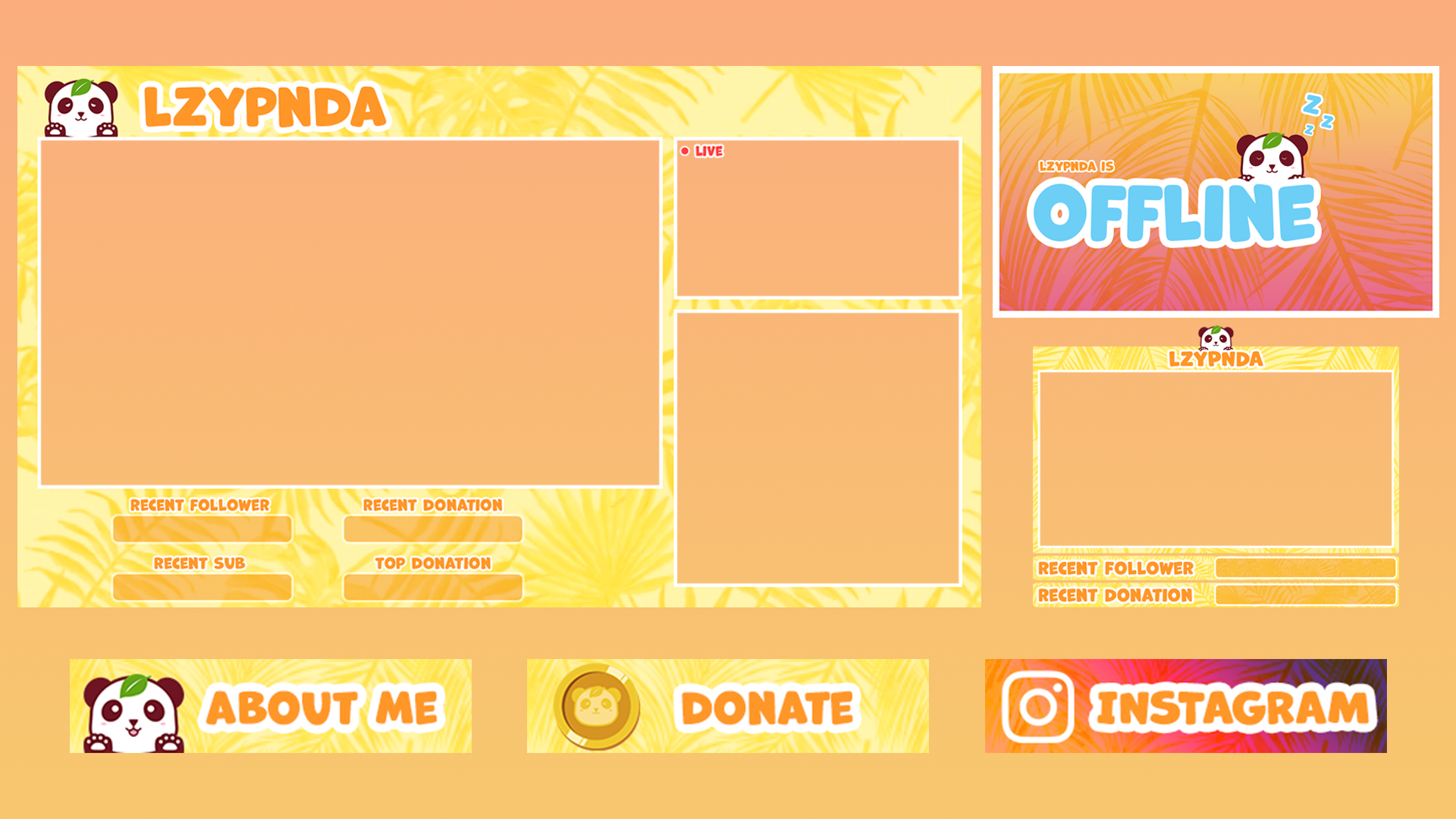
OTHER STREAM ASSETS
In addition to the panda icons, I also made stream assets such as webcam overlay, downtime layout, offline banner, and info panels. All of them have the paradise/island theme to it and the font I chose also helps contribute to the cute element of the design.
If you would like to see these assets in action, check out my friend’s stream over at https://www.twitch.tv/lzypndaz