

TOM CLANCY’S RAINBOW SIX SIEGE: UI REDESIGN
INDEPENDENT PROJECT
UI/UX DESIGN
SEP 2019 - DEC 2019
ADOBE XD / Illustrator / unity
OVERVIEW
Tom Clancy’s Rainbow Six Siege is a tactical FPS, well known for its intense close quarters combat, high lethality, and tactical decision making. While the game itself is revolutionary, the user interface is outdated and not user friendly. Therefore, the goal for this project was to create a more streamlined and elegant user interface, specifically for the operator and weapon customization screens.
PRESENT ISSUES WITH THE UI
After playing the game for some time, I realized that the interface could be improved to create a better experience for the player. Most notably, the operator and weapon customization screens could use some improvement.


Problems Addressed:
Loadout, helmet, and uniforms are all displayed separately which means the player will have to go through multiple layers (screens) to get to where they want.
Total of 4 screens that player needs to get through to change attachment (Operator screen > Loadout screen > Specific weapon attachments screen > attachment customization screen).
Player cannot immediately see what their loadouts & operator uniforms/headgear are without going through each of their respective screens.
User Feedback:
To see if the player base felt the same, I interviewed some users. Everyone agreed that the interface could be improved and thought that my suggestions were worth exploring.
COMPETITIVE ANALYSIS
Before heading straight on into redesigning the interface, I thought it would be a good idea to see what other similar games have done with their character and weapon customization screens. From my research, I identified two games that I could pull ideas from to make changes to the interface.

Tom Clancy’s Ghost Recon Wildlands (Ubisoft)
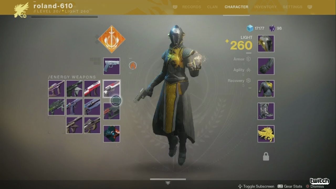
Destiny 2 (Bungie)
Character showcased in the middle of the screen, surrounded by options.
Each box houses weapons that correspond to a type. Expands on cursor hover.
Small transparent boxes next to weapon to show how many are in it.
Clean, simplistic, elegant.
Controller friendly
Grid based layout. Shows the gear and info displayed alongside each other.
Character is showcased alongside everything.
Use of tabs up along the top, similar to Rainbow Six Siege.
Controller friendly
WIREFRAMES
After doing research and generating ideas, I started to create my wireframes. Below are some of the iterations I went through before getting to the final ones that I was satisfied with and resonated well with users.
Wireframe Iterations
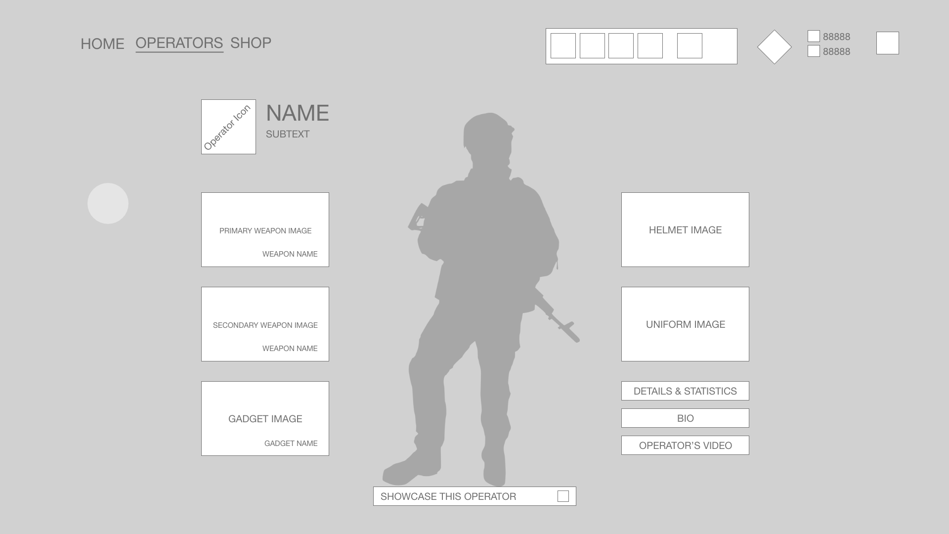

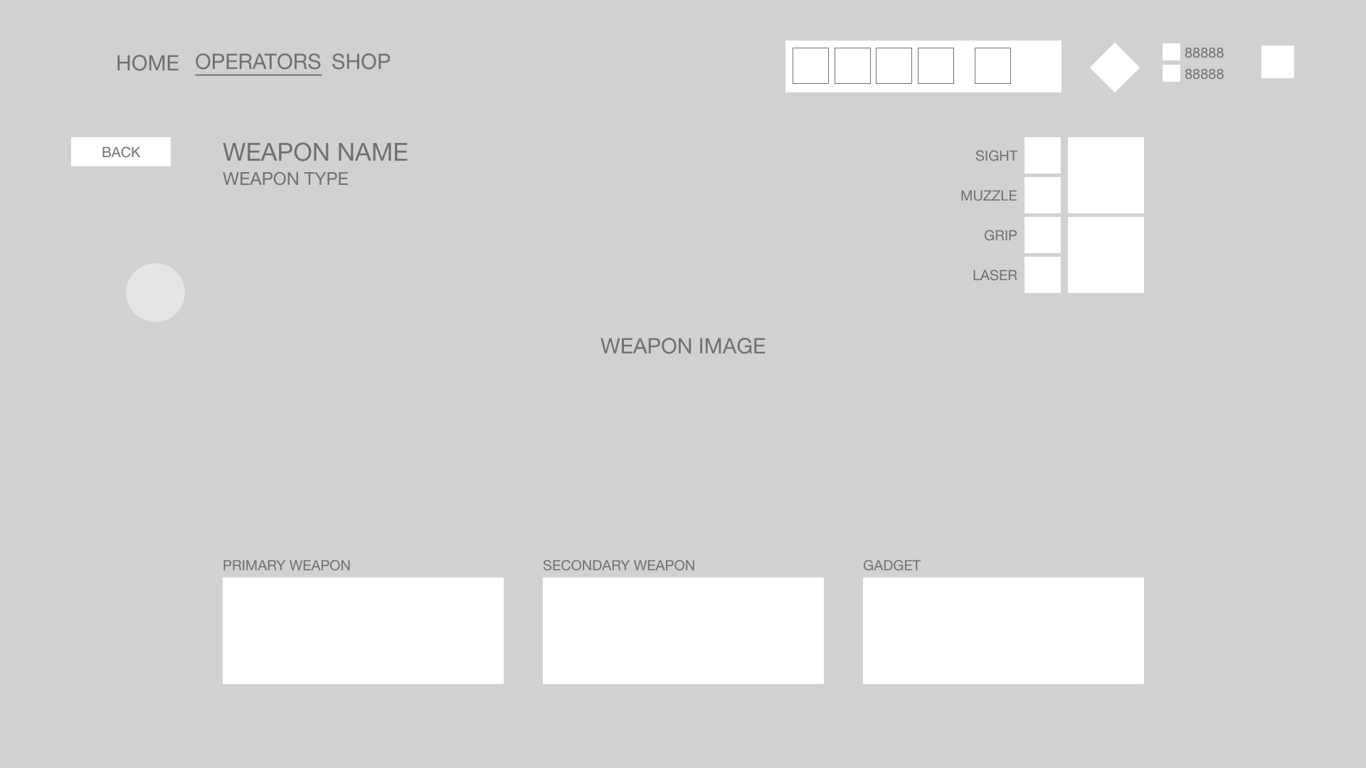


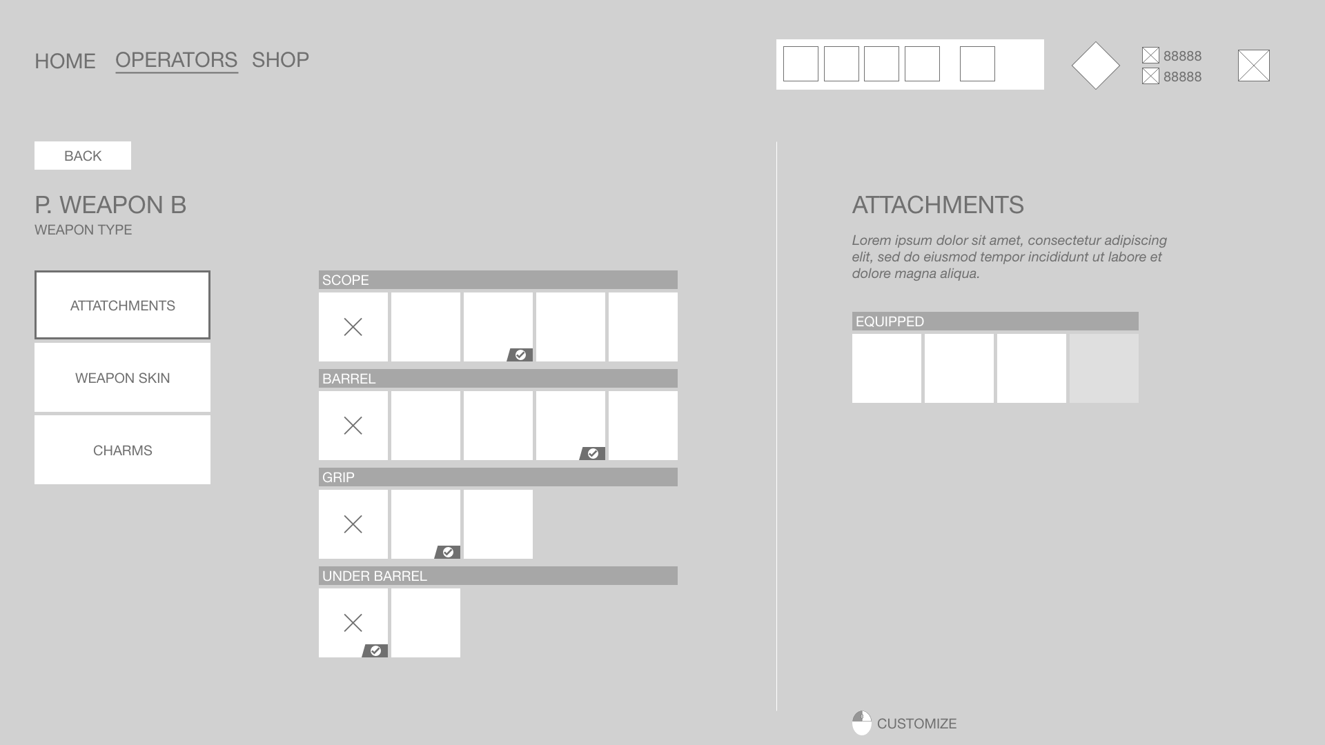
Final Wireframes

WIREFRAME TESTING
User testing was conducted compare user feedback from the original interface and the wireframes. Users ranged from ones who were familiar with the game and those who were not. This is what users had to say:
Most users thought that the wireframes were a huge improvement from the original.
The flow felt better and users liked being able to see/preview things before going into a specific screen.
Some users had problems understanding what some icons represented.
I was pretty happy with the results as this meant that the wireframes were starting to improve and get to the quality that I wanted them to be.
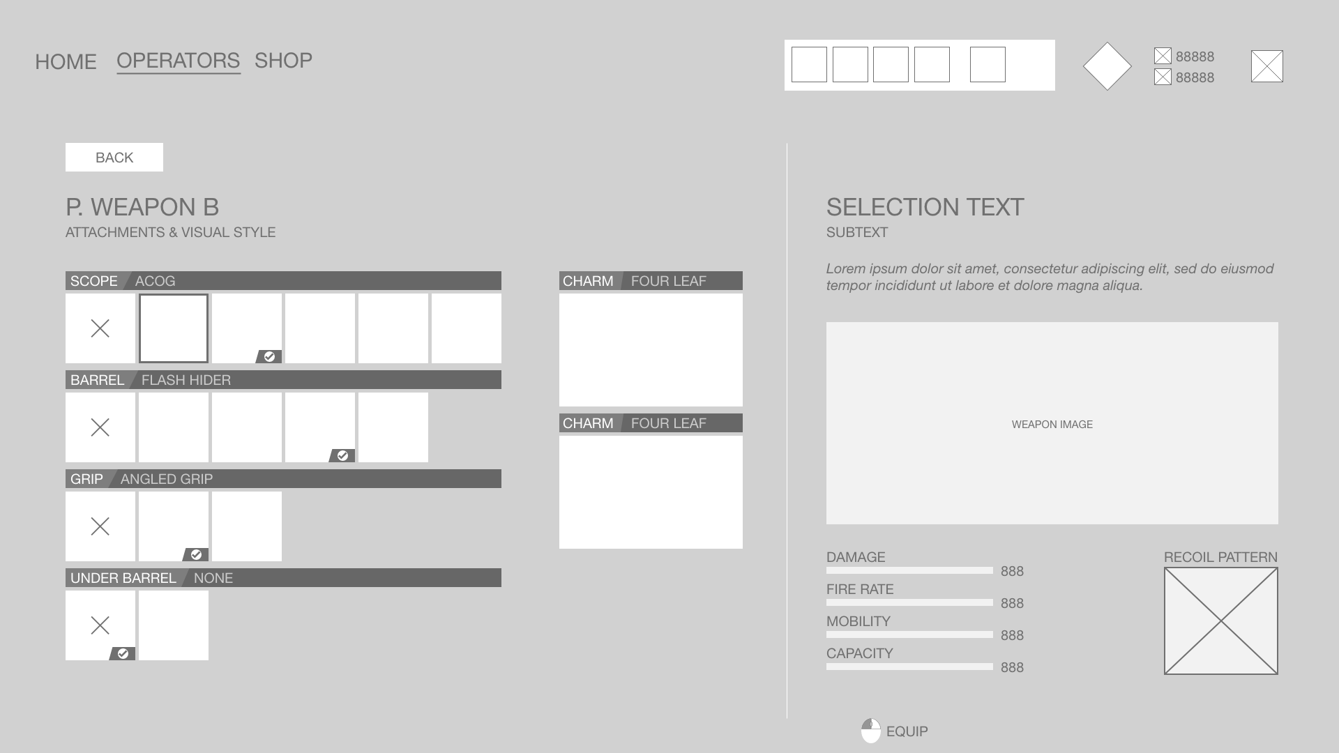
HIGH-FIDELITY MOCKUPS
After I was done with the wireframes, I moved onto making the high-fidelity mockups. The goal for this was to emulate the look of the existing interface so it felt familiar to players within the franchise. However, I did take some creative liberty on some parts but overall it does look almost exactly like the original.


HIGH-FIDELITY MOCKUP TESTING
I tested the mockups with users, putting a focus on the look of it and results showed that users thought that it actually belonged in the game! Users also liked how fluid it felt overall as well as being able to see information up front. I felt more confident with this project and all I had to do now was to fix up some things and start on the interactive prototype.
PROTOTYPING
Initially, my plan was to make the prototype directly in Adobe XD as that was where most of my wireframes and high-fidelity mockups were being made. So, it would have been an easy transition. However, since this was a project for an actual game, I thought it would be fitting to make the prototype in an actual game engine, which I chose to use Unity.
I don’t find myself being a UI programmer in the future, but I wanted to get out of my comfort zone and take a go at it. This was also when we were ordered to stay quarantined in our homes due to COVID-19 and so I had to get used to the transition. Therefore, there were some hurdles that I had to overcome during this process.
Things were going quite well for the prototype, but there were some things that I could not get resolved due to technical limitations and time. For example, saving and updating changes made to a weapon in the customization screen to a weapon on the operator screen.
PROTOTYPE TESTING
Testing showed that the prototype was functional, aside from the problems that I was not able to fix or get to. I was just happy that it works and can get the point across.
Here is a video showcasing how the redesign would function if it was implemented into the actual game:
REFLECTION AND POST-MORTEM
This project was definitely a long and arduous experience. Although there were some bumps along the way such as some problems within my prototype or the fact that I was quarantined in my house indefinitely and haven’t been outside since, I am happy with what I was able to accomplish. The goal was achieved which was to streamline the operator and weapon screens.
The prototype works and gets my point across to where it could help an artist with asset creation or helping a programmer with how the UI should flow and work. I am in no doubt a UI programmer, but it was nice to get experience in it as I learned a lot from it. I was also able to get my goal accomplished which was to redesign the Rainbow Six Siege interface, and I am satisfied that I was able to complete it.
Even though the prototype is finished, it could definitely be improved. If I were to continue work on this, I would add a couple more things such as adding more animations to the UI. I would also revisit the issues that I was having before and try to get those fixed to further enhance the prototype. Furthermore, while this redesign had mouse/keyboard and gamepad controls in mind, it was not tested with a controller, nor were the controller UI inputs displayed. Therefore I would also go back to showcase controller functionality.
